RSS Feed


 November 28th, 2023
  Awake Goy
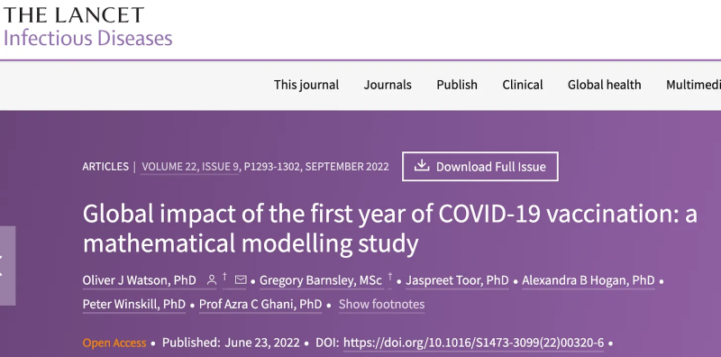


Denis Rancourt
Denis has a PhD in Physics (1984, University of Toronto), is a former tenured Full Professor (University of Ottawa), and has published over one hundred articles in leading science journals. Denis’ reports and articles can be found on his website at denisrancourt.ca.
Dr. Denis Rancourt
All Cause Mortality Worldwide and in Romania
Okay, I’m going to talk about something quite different. I’m going to talk about all-cause mortality. I’m not going to be concerned about what caused the death. We’re just going to count deaths. And I’m going to show you data for Romania as well. And all of the graphs and results that I will be presenting are in several scientific reports that I’ve, myself and collaborators have been writing for the last three or more years. And they can be found on this website, the scientific reports. And these are my main collaborators on the all-cause mortality research. And two of them are in the room here with us. They’re from Prague. And another place that I told them I wouldn’t forget the name of, and I just did, I’m sorry about that, Jérémie.
(01:05):
And so I want to start the historic record, almost 1900. I’ll show some data starting in 1900. I’m going to start really at the beginning of Covid if you like. Now all-cause mortality, you’re just counting deaths. And this is the case of France from 1946 on, just after the Second World War. And what you find everywhere in the Northern Hemisphere is that death is higher, is larger in the wintertime and it comes down in the summertime. And so it has a seasonal pattern that’s very regular.
Denis Rancourt (00:11):
This has been known for more than a hundred years. And I would argue that it’s not completely understood. I would argue that it’s far from completely understood, but this is what the pattern looks like by month. So we’re looking at mortality by month in France. And if you integrate by year, by cycle year around each winter from summer to summer in France, it looks like this. So there can be an intense winter followed by a lower winter and so on. And the pattern looks like that.
(02:17):
So since the end of the Second World War, mortality on a population basis has been decreasing mostly. And it’s typically 1% of the population that dies in a given year. So this is the kind of data we’re going to deal with. And that last year is the first year of the so-called pandemic. And now if we go to the USA, to give another example, I can do all-cause mortality. This is by year now for a particular age group. This is the 15 to 24 year old age group. And I’ve separated into male and female.
So you’ve got the two colors there. And this graph allows us to illustrate what you can see when you measure mortality, which is a hard figure. Nobody can tell you that the government didn’t count the deaths correctly because they’re very serious about counting deaths and it’s a legalistic process. And so this is hard data. And this is what you see.
(03:18):
You see that there was an event in 1918, that event was recovered by the CDC and called the Spanish Flu. I know, and there are several scientific articles that show that this was not a viral respiratory disease. No one over 50 years old died in that huge peak of mortality. Only young adults and families and teenagers died in that peak. And the rich didn’t die in that period. So that was 1918.
And then in the United States you have something called the Great Depression. Huge economic collapse followed by an economic related the Dust Bowl, which was an environmental catastrophe partly. And those were the big hardships, recent hardships in the USA. And you can see the mortality there in both men and women in those periods. Then in the Second World War, you see that men have a mortality, whereas women do not. And I think we all understand why. And in the Vietnam War period, you can see that there’s a hump in mortality for the men. This is what you can see in all-cause mortality.
(04:30):
And so in conclusion, I’ve been studying all-cause mortality extensively in more than a hundred countries on all the continents except Antarctica obviously, and in great detail by unit time, by week, by day, by month, by age group, by sex. And I can tell you that the only thing you can see in all-cause mortality data are the following things. Seasonal variations, like I explained. A maximum in the winter and in the Southern Hemisphere it’s reversed. Their winter is our summer. That’s when they have a maximum of mortality. In the equatorial region, there is no seasonal variation in mortality. There’s no spikes, it’s a flat line. So there’s seasonal variation that follows the hemispheres.
You can see wars, like I mentioned. You can see economic collapses, huge economic collapses that affect populations. You can see summer heat waves in northern latitudes that are not used to having a very hot period in the summer, that kills people, sometimes because they fall down the stairs when it’s really hot, but it kills people. And you can see a peak that lasts about a week in one of these hot spells.
(05:44):
You can see earthquakes. Right away, you see the earthquake. People get crushed by buildings. You count the dead and you see a peak due to earthquakes. But we do not see or detect any of the CDC-claimed pandemics that occurred in 1957, ’58, ’68, 2009. Those pandemics, those so-called pandemics do not give rise to any excess all-cause mortality that can be detected in any jurisdiction and or by any mean. Excess death cannot be detected on the national or state scale for these so-called pandemics. So they did not cause excess death, whatever they are. And then you have… I explained 1918.
Then we have the Covid period. And in the Covid period there was a huge assault. There were many, a multi-pronged assault against people, vulnerable people in many different jurisdictions. So depending on what the state did before they brought in the vaccines… I’ll talk about the vaccines as well. But depending on what the states did, they caused excess mortality, sometimes huge amounts of it. And I’ll show you examples of that.
(07:00):
So first I want to tell you that something just happens socially as part of the propaganda, which has that the Nobel Prize was awarded for this so-called vaccine. And I want to show you how absurd this is because all the politicians that were supporting this were claiming that tens of millions of lives were saved by the vaccine, this magical vaccine for which we had given the Nobel Prize.
Well, we looked at that, we looked at the basis for that claim, and the basis for the claim is an article that appeared in Lancet Infectious Diseases in 2022 by Watson et al. And they claim that between 14 and 19 million lives were saved. So we as physicists, as scientists, we said, “Okay, if that’s what you’re claiming, let’s calculate and see what that would look like on the scale of all-cause mortality by time.”
(07:54):
And so let’s start somewhere and let’s go to Canada and we see the seasonal cycle. So this is all-cause mortality on a scale that starts at zero. And let’s look at the seasonal variation. That vertical line is the declaration of the pandemic. The very first peak you see in blue there, is Canada killing elderly people and vulnerable people in hospitals and in care homes because of the aggressive initial treatments because they were concerned about this so-called pandemic.
And this happened in many hotspots in Western countries, but it did not happen in any of the Eastern European countries or in Russia. So depending on the country, depending on what they did, that’s the thing. It did not happen in Germany where they were not doing this. Okay. Then we go on and we bring in the vaccines and they are claiming that this vaccine, which is the number of vaccines, is that gray curve. That’s the cumulative vaccine doses being given in Canada.
(08:56):
And what you see is they’re claiming that, “Thank God we brought in the vaccines at that time because otherwise we would’ve had the mortality in red there.” They’re claiming that their vaccines saved us from having the mortality in red that they calculated. They’re claiming that there would’ve been mortality like we’ve never seen in the history of a human society.
And that thank God this vaccine came at just the time when there would have been this incredible mortality and saved us and brought down the mortality to basically the same level we’ve always had. That’s what the vaccine did. Not halfway down, not somewhere in between, but just brought things down. This is the magic of the vaccine that is explained by the magic of mathematical models written by bought-out scientists working for bought-out politicians. So it is not true. The vaccine did not save lives.
(09:50):
In fact, and I’ll show Romania. I’ll skip some slides. This is Canada again. But instead of showing raw all-cause mortality, we’ve corrected the mortality to show only the excess of mortality and therefore you have a flat baseline until the pandemic and then you can see the excesses that occur at various times depending on what the government was doing. And again, the curve of predicted saved lives.
Now, we can do this in the United States. The United States was a country that has many more vulnerable people, health-wise than Canada and treated them very aggressively. So the baseline, if you like, excess all-cause mortality in blue there has huge features which you do not see in Canada. And this is a very strange virus that we’re dealing with here because it carries a passport. It refused to cross from the US into Canada, despite the fact that it’s thousands of kilometers of the two biggest exchange partners on the continent.
(11:01):
The vaccine was not crossing borders. It didn’t cross initially into Germany. When we draw maps of intensity of excess mortality, we see that the vaccine has definite passports depending on jurisdiction. In other words, this was not a spreading viral respiratory disease. Our conclusion from studying all the all-cause mortality, I’ll tell you our conclusion before we get there, is that there are data, this hard data contradicts the idea that there was a particularly virulent pathogen that came onto the planet and that spread and that caused havoc by itself.
Instead what we see is that everywhere that there is excess mortality, you can understand it in terms of the incredible aggressive treatments that were done and the vaccines, which we can quantify. I gave you the conclusion ahead of time, I’m skipping ahead a bit, but no matter. This is what Europe looks like, over all Europe or the countries that we were able to include here. It looks quite similar to the US, the situation in the US.
(12:06):
Now let me show you Romania. In Romania there is no excess mortality at the beginning right after the pandemic is announced, that just is a feature of hotspots in the Western European countries. But then there is a massive excess peak that starts. We’re going to talk about that a little bit more because we don’t… I’m starting to understand it as I talk to people who know more about Romania. And then the vaccines are rolled out. And I know that Romanians didn’t get vaccinated maybe as much as others, but still, the claim in this theoretical paper is that the excess mortality would’ve been that red line if there had not been the vaccines.
But what I see when I look at that pattern is that there’s a peak right when you start rolling out the vaccines, then there’s a really large peak when you roll them out again and then you see that last peak there is directly associated to the booster doses that we’re given. So I’m going to look at that in some detail at the end of the talk when I talk about Romania.
(13:11):
So coming back to all-cause mortality, not this theoretical redline stuff of what theorists are telling us, but coming back to the hard data, this is what it looks like in the United States. So on the bottom you have all-cause mortality by month. You have the vertical line in each graph that shows the announcement of the pandemic. And mysteriously, at the announcement of the pandemic, there are hotspots synchronously at the same time in hotspots around the world where there’s this huge initial peak of mortality. I was the first to write an article about that and to point out that normally viruses do not follow political directives and they don’t, so it has to be something else. And also there’s no evidence that there was spread in this feature.
(13:58):
It happens synchronously in the whole Northern Hemisphere for example. And there’s no evidence that it then spread. It was localized, it stayed there and it was due mostly to extremely aggressive medical treatments because the medical teams were told, they were propagandized that there was this horrible virulent thing that was just going to come down on us. And now we’ve just announced it’s a pandemic. So they had a license to try whatever help they could give and sometimes they prescribe too much. They intube people with mechanical respirators, a ghastly thing to do.
And the places that did this most aggressively, these treatments, and we can follow that in our data, had the largest peaks of this type. Northern Italy, even Stockholm was protecting the elderly especially, and they had a peak like that. And New York City obviously is well known. So this is mainly the New York City peak that you see in the US data here. Then the curve in the middle, is all-cause mortality again, but by week now, a finer time resolution. So you can see more of the details. And the curve on top is a blowup of that.
(15:12):
And what you see for the first time in recorded history in the US and the mortality history is peaks occurring in midsummer in the United States. Unheard of. And so I put black dots there to show them. The first one occurs at a time when they were really aggressing poor people who live in the very hot southern states. And the integrated mortality for that correlates with poverty. If you were poor, you died at that time. If you were not, you didn’t die. And then they brawled out the vaccines.
And the summer peak you get on rolling out the vaccine there is from what they called vaccine equity, which meant they hired thousands of people in the US to go and vaccinate everyone who hadn’t been vaccinated yet, who were resisting or who were far away in a care home. And they aggressively went and vaccinated all those people. It was funded by Gates and all those people and they produced that huge peak of mortality in the US there. So that’s what the US mortality in recent times Covid looks like.
(16:19):
If you look at now mortality in the US by age group, you can see the age groups there, zero to 24 years, 25 to 44 and so on, before they vaccinate, the percent increase the excess mortality expressed as a percent of the baseline mortality for the age group, looks like that on top. And in the vaccination period, the age structure of mortality changes dramatically and shifts towards younger individuals. That doesn’t mean that quantitatively the elderly were not dying.
Most of the deaths are in the elderly as you would expect, but this is expressed as a percentage of the baseline. So in those terms it shifts to younger people. And in the US the total excess mortality in the COVID period as a whole correlates perfectly with poverty in the state for the 50 states in the United States. You will never see this in social science, such a strong correlation. It’s very rare.
(17:20):
And not only is it a strong correlation, we call it… It’s technically called a very good correlation when it’s that value of the correlation coefficient. And it goes through the origin, which means it’s not just a correlation, it’s a proportionality. The more poor you had in the state, the more people died in that state. Directly proportional. So this tells you… That’s another thing that viruses don’t do. They don’t select to only kill poor people. That doesn’t happen. That’s not a signature of a viral infection. So our model of what’s been going on to cause mortality in the great majority of jurisdictions that we saw is the following model.
We stress the literature… Well, first of all there is what governments did. The socioeconomic impact. Many people lost their jobs, lost their social contacts, lost their regular activities, lost their position in society. So incredible stress related to that. There was regulatory rules of all kinds. There was institutional pressures put on people. There were all kinds of conditions that you know about.
(18:30):
And in some countries it was much more violent than others. In Peru, they hired 10,000… They called in 10,000 military reservists right away to go and find all the people that could be found that would test positive for Covid and they would extract them from their families no matter how old they were and isolate them. And there’s a huge mortality peak in Peru as a result of that practice. So there was aggression. It caused psychological stress and social isolation. And scientifically that is known to depress the immune system dramatically. This is very well established. It’s a whole area of science to study this relationship with stress.
And so therefore you have that reduction in the immune system, and so you are more vulnerable to every kind of infection. And when you have in a large population depressed immunity, one of the organs that’s most susceptible to immediately being infected is the lungs, because you already have an entire ecosystem of bacteria and everything in your own mouth and in your respiratory tract, and many of those can become quite dangerous to your lungs. So you get bacterial pneumonia.
(19:45):
And my time’s up and I didn’t even get to the vaccines or Romania. So I’ll just show you the Romania data. Okay. So again, this is years of work, more than 30 scientific reports about science related to Covid that you could find on my various websites, on our websites and the one I gave. And so if we look at, this is how we prove that the vaccines were actually causing the death, is that every time you rolled out a dosed, you got immediately following an excess mortality. So this is the case of Israel. So doses one and two, then the first booster, the second booster, and so on. And you can do it by age group like we’re doing it here. You start with the most elderly and you go down by age.
(20:32):
And what you find is that by age, the toxicity of the vaccine, because we come to understand that the vaccine is a toxic substance that each person is going to react to differently, just like in toxicology, that if you give more doses, it’s more dangerous because there’s damage from the first doses. All the principles of toxicology are being followed here in addition to the high age dependence. So what we found is that there is an exponential increase in the toxicity of the vaccine per dose. And the doubling time by age is four or five years of age. So your risk of dying per injection doubles every four or five years in age.
(21:14):
In Israel, for example, if you’re 80+ years old, you’re getting into almost a 1 percent death chance when you get infected and it’s higher in other countries. So we looked at Peru, you can see the massive peak there in Peru due to the military coming in. Here, this is the 90+ age group. You can see the doses being rolled out. The one in color is the fourth dose, the peaks that are associated with it. And then we follow it as a function of age all the way down. We’ve got a lot of good data.
(21:49):
And then we do a graph of what happened in Peru, and we can do the same thing for Chile. And we see that those four in both of those countries gave that exponential rise, always the same doubling time, four or five years. And you’re getting into one death per 20 injections here in the 90+ year-olds. So it was the elderly people who were mostly killed by the vaccines in terms of all-cause mortality. Of course the young suffered death and all kinds of horrible side effects and so on. But in terms of mortality, the big groups that were dying that were contributing to the excess mortality is the elderly.
(22:28):
And so that’s the conclusions about vaccines. So from this work, we’re able to calculate how many people would’ve died globally, given that we’ve studied so many countries now and we find that 17 million people were killed by the vaccines on the planet. That’s our number. And I’m going to ignore that buzzer because I want to show you Romania. This is the data for Romania by age group. This is the correlation between the vaccine rollouts in dark blue and these huge peaks in excess mortality in Romania.
There’s no initial peak like you see in the Western countries. There’s that one with the question mark that we have hypotheses about and something very horrible happened in Romania to explain that. We have ideas about it. And then you have the vaccine deaths, and the last one is the booster. And so in Romania we did a preliminary analysis of that booster and it is killing, you get one death per five or 10 injections in the 80+ year olds in Romania from the boosters. That’s our conclusion, preliminary conclusion on the Romanian data. And that’s my conclusion with the talk. And that’s it.
(23:42):
I can give it to you. Or it was actually the last slide, which I forgot to show. But no, that may be complicated. I don’t… Oh, is it on now? No, no, it’s not possible, I think. Correlation-canada.org. This site, when you go to research, the research end, there are peer-reviewed papers in there, there are scientific reports and there’s some amazing work, theoretical work as well that proves, for example… I’m going to tell you this because it’s too important.
You’ve got to look through these papers. We have proven that if you accept theoretical epidemiology as it was used by governments, you can show that if you want to protect elderly people, the worst thing you can do is isolate them in care homes and in their homes. It is absolutely the thing that will maximize infections and death. And we showed that it’s now a peer-reviewed accepted paper, and we showed that that was true in general for the elderly.
(25:43):
So the governments have been saying that we have to protect the elderly by isolating them and preventing them from being infected. And we proved using standard epidemiological models with all the possible parameters that the opposite is true. So the government has been truly lying on that. They should know better. These models have existed for a decade. So that’s just another example of the work we do. There are many different things that we’ve done during Covid, if you want to study that website.
Republished from the author’s Substack


 Posted in
  Tags:
Tags: