RSS Feed


 May 25th, 2012
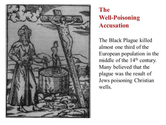
  FAKE NEWS for the Zionist agenda

Per Square Mile/Public Domain
Above, find a satellite snapshot of Oakland. Below, see a similar photo of nearby, but much richer, Piedmont, California.

Per Square Mile/Public Domain
Even from space, it’s easy to tell which neighborhood is poor and which is rich. It’s pretty straightforward: richer communities can afford more space for trees, and place a higher premium on growing and maintaining them. All you need to do to spot better-off neighborhoods is to look for the tree cover.
Tim DeChant, who blogs over at Per Square Mile, has a pair of interesting posts up documenting this phenomenon. In the first, he explains that
for every 1 percent increase in per capita income, demand for forest cover increased by 1.76 percent. But when income dropped by the same amount, demand decreased by 1.26 percent. That’s a pretty tight correlation. The researchers reason that wealthier cities can afford more trees, both on private and public property. The well-to-do can afford larger lots, which in turn can support more trees. On the public side, cities with larger tax bases can afford to plant and maintain more trees.
In the Per Square Mile, has a pair of second, he uses satellite photos to compare 6 poor and wealthy neighborhoods from the same city. Read both.
This is thoroughly unscientific, of course, but the effect is pretty stunning. Here’s Ball Square in Somerville, MA vs. West Cambridge

Per Square Mile/Public Domain
and

Per Square Mile/Public Domain
The absurd thing here is that even trees themselves can come to reinforce socioeconomic standards; in this case, one that helps the rich get richer. An abundance of trees improves air quality, provides shade, reduces allergies, and even helps improve the mental health of nearby residents. People in tree-lined neighborhoods are likely to be fitter, happier, more productive.
It all makes a pretty powerful argument in favor of tree-planting initiatives in lower income neighborhoods.
 Posted in
  Tags:
Tags: