RSS Feed


 December 12th, 2023
  Awake Goy
Notably the NZ govt is keeping up a stunning silence on this (even continuing with the ‘safe & effective’ mantra) especially in light of the recent revelations from the Govt’s own data analyst whistleblower!
For a list of links on topic go HERE
Medicare death data proves the COVID vaccines are killing people. No more doubts. The debate is over.
Medicare death data proves the COVID vaccines are killing people. No more doubts. The debate is over.
Executive summary
If you do a simple plot of the absolute number of deaths per day after a vaccine shot is given vs. the number of days that have elapsed since the shot, other than for a brief 21-day period after the shot, the number of deaths per day will always monotonically decline over time in a safe vaccine. But for the COVID vaccine, it monotonically increases over time for 365 days straight.
A positive slope for 1 year post vaccination is unprecedented. It means the COVID vaccine is killing people. There is no other explanation.
This is why the CDC never will show America the Medicare data. Never. The truth has to be hidden from everyone.
And this is why the medical community never asks to see the data.
If they saw the data, doctors would have to admit they were wrong.
The same effect has been observed in the four other countries I have this data on: New Zealand, UK, Israel, and the Maldives.
What more do you need to know?
Introduction
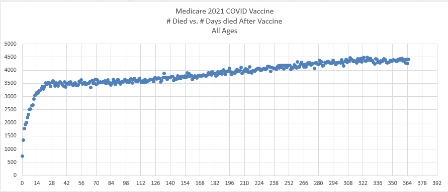
I’m going to show you below two charts from Medicare, all ages.
Note that Medicare is mostly older people and the average mortality rate is around 4% per year.
These are all people who got vaccinated in 2021 and it looks at the number of deaths per day since the first shot of the vaccine was given in that year (if more than one shot was given). The x-axis is the days since the shot was given. So it is relative to the day of the shot.
So the age distribution of the cohort is determined by the age mix of the people who got the shot in 2021.
Over a one year period, the age distribution will change by a small amount since people die. So the fixed size cohort (the number of people who got the shot in 2021) gets smaller over time.
But the bottom line is that for a safe vaccine, the line always slopes downward after a brief upward slope for the death rate to get to baseline caused by the temporal healthy vaccinee effect (tHVE). This effect lasts up to 21 days or so. So starting on Day 28, the slope should always be going downwards.
The downward slope of the charts is a fundamental property of death: deaths per day are simply proportional to the number of people who are alive. The mix doesn’t matter. It always slopes down.
So if you have an overall 4% death rate, the number of people dying per day should be 4% lower than at the start of the period. In summary, the slope of the line will be set by the average age of the cohort who got the shot.
There are secondary effects. The two biggest are:
- The age mix of the remaining cohort changes over time as people die off,
- People are a year older at the end of the observation period and thus die at a slightly higher rate than at the start. For example, if you have 100 year olds dying at 43% per year, by the end of the year they are dying at 50% per year, a 16% relative increase and a 7% absolute increase in death rate. There are simply a lot fewer people available to die and it isn’t overcome by the increase in the death rate which works in the opposite direction. So this effect results in the negative slope being slightly less than what is predicted from the primary effect, but it is still negative.
In practice, these secondary effects never change the direction of the slope: it is ALWAYS negative, i.e., on average, fewer people die every day.
This is fundamental because there are simply fewer people left to die and the change in the death rate caused by aging is always a fraction of the death rate itself.
This is why, when we look at all age stratified curves just to make sure, it always slopes down. In general, the older the cohort, the more the downward slope.
The effect of background extinction events
The only thing that can temporarily alter the negative slope is an external event that kills people such as a COVID wave. If the vaccine is given over a short time period, you’ll see this as a brief blip upward, but it will not be sustained.
Conversely, if the vaccine is given evenly over time, background effects will all be averaged out and just shift the line upward, but will not affect the downward slope.
Pneumococcal vaccine curve (Medicare 2021 all ages)
This is the pneumococcal vaccine curve from Medicare in 2021. All ages. It looks at people who were vaccinated sometime in 2021, and looks for 1 year after the shot to see if they died. The x-axis is the days relative to the shot day that they died.

COVID vaccine curve (Medicare 2021 all ages)
This is the exact same chart as above, but this time for the COVID vaccine and tracks the days till death from their first shot (if they had >1 shot in 2021). Do you see the problem? The slope is positive. It’s supposed to be negative.
Analysis
This isn’t rocket science.
The pneumococcal vaccine slopes downward exactly as expected from 308 average down to 288, a decrease of 6.5% over one year.
The COVID vaccine monotonically slopes upward from an average 3492 deaths per day after the shot to 4365 deaths per day, an increase of 25% over one year.
This is stunning. It is unprecedented.
The COVID vaccine is supposed to slope down like every safe vaccine as noted in the introduction. It’s a law of nature. Monotonically sloping upward over a one year period has never been seen before. It is inexplicable. There is no background event that could cause this to happen. Most of the COVID shots for the elderly were given over a concentrated period of time (in the first 3 months of the year).
Plots from New Zealand show the same effect
This is from the 66K spreadsheet in the data repository:

Plot from Israeli Ministry of Health: same effect
From my MIT presentation:

Plot from UK ONS: mortality goes up after the shots delivered
From my MIT presentation. Note that the UK ONS obscures the effect by choice of bucket size. So we can see it on a temporal basis by looking at 21 days ago over time.

Plot from the Maldives: same effect
From my MIT presentation:

Is this proof that the COVID vaccine caused these deaths?
Here’s what we know:
- This effect has never been seen before (monotonic increase over 365 days since the first COVID shot). So it has to be caused by something novel, not in existence before 2021.
- It is not a background effect or we would have seen it in the pneumococcal vaccine
- The medicare queries that we run for both graphs were identical except for the vaccine, so it isn’t a coding artifact.
- The effect is ONLY seen for the COVID vaccine.
- The effect is correlated to the administration of the COVID vaccine.
- Increasing mortality by a 30% differential is huge. What it is causing this had to have been injected into people because nothing external kills people like this.
- The effect is happening in every country I have COVID vax data on.
If it wasn’t the COVID vaccine causing the increase, then what was it that fits all the parameters listed above? Nothing. That’s the proof. There is simply no other explanation.
But of course, we have tons of data that the COVID vaccines kill people, so this really wasn’t a surprise.
Are there any safe vaccines?
Not that I’m aware of. A safe vaccine would kill fewer than 1 person per million.
The pneumococcal vaccine easily exceeds that threshold on Day 0.
But the remainder of the death curve appears as we would expect a safe vaccine to look (if there was such a thing).
Why doctors will ignore this
Doctors need to earn a living. If they speak out about the vaccine, they will be fired and/or have their board certifications revoked.
So they have to lie to their patients. It’s self-preservation. Dissent simply isn’t tolerated. If you don’t toe the line with consensus thinking, you’re out.
So the killing will continue indefinitely because doctors are muzzled. That’s just the way it goes.
Summary
The longer the mainstream media, Congress, health authorities, and the medical community ignores this data in plain sight, the more clear it is that they are corrupt.
That is raw data, unprocessed. No tricks. No Simpson’s paradox. Same year. Same query. Different vaccines and dramatically different outcomes. It is simply unexplainable if the vaccines are safe.
Please share this article with your doctor and ask them to explain the two death charts to you and tell you why they believe that both vaccines are safe. Then, ask them what an unsafe vaccine would look like. Please record the conversation and post it.
Image by Dean Moriarty from Pixabay (text added)
 Posted in
  Tags:
Tags: